You've seen the posts. "RSI under 30, oversold." "Golden cross, bullish." "Price far below the 200-day average, time to look." Each one names a reading and implies what comes next. Almost none tells you how often that "next" actually happened.
That is the gap we work in. Every indicator reading we show comes with four things: how rare it is for that asset, what followed every comparable case before, how that compares with an ordinary day or week, and how often it went badly first. This page explains how we count each of them, so you can check our work.
Why compare a reading with the asset's own history?
Because a textbook threshold means different things for different assets. An RSI of 30 is routine for a volatile mining stock and rare for a consumer staple. So we place every reading in the asset's own past: what share of its days or weeks were lower, or higher. A reading in the top or bottom few percent is an extreme for that asset, whatever the textbook says.
We do this on daily and on weekly data, because a stock can be stretched on one and calm on the other. Weekly readings use completed weeks only. A day or week that hasn't closed yet never counts.
Why look at hundreds of cases instead of one stock?
One stock rarely has enough history to judge. A reading that came up eight times can point anywhere by luck. So we pool: we take the same indicator, on the same timeframe, at the same rarity, across every asset of the same kind, and look at what followed each case.
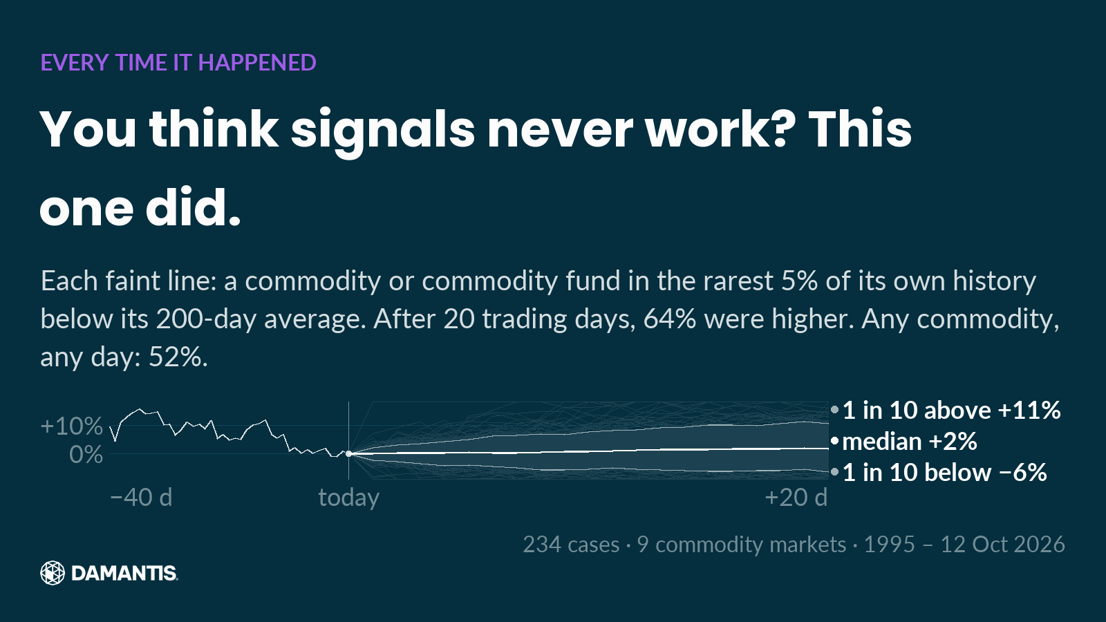
The chart shows one pool: every time a commodity or commodity fund sat in the rarest 5% of its own history below its 200-day average, 234 cases in all. Each faint line is one case. The white line is the median. After 20 trading days, 64% of them were higher.
When we work out how rare a past reading was, we use only the data available at that time. No past case gets to know its own future.
What is a base rate, and why does it matter?
"64% were higher" sounds impressive until you ask: compared with what? Prices rise more often than they fall over most stretches. So next to every result we show the base rate: how often any asset of the same kind rose over the same stretch, from any starting day. For the pool above, that was 52%.
A result only means something if it beats the base rate. Many popular signals don't. When a reading did no better than an ordinary day, we say so. That is often the most useful thing we can show.
Why show how bad it got first?
Because an average hides the path. "The median case rose" says nothing about the weeks in between. For every case we measure the worst drop along the way and how long it took to get back to the starting price. If a third of the cases fell another 10% before recovering, that belongs next to the average.
How do we know a pattern isn't luck?
We scan about 2,500 readings every night. With that many, some will look meaningful by pure chance. So before we call a pattern robust, it has to pass three checks:
1. It beats the base rate by a clear margin, counting cases in the same month only once. When the whole market falls, many assets hit their extremes together, and those cases aren't independent. 2. It points the same way in the older and in the newer half of the data. 3. It points the same way when the stock market as a whole was rising and when it was falling.
If all three hold, we may say "this pattern held in every split we tested". Our software checks that sentence against the data before a post can be built. If the data stops supporting it, the post is blocked. If the checks are mixed, we show the path and make no pattern claim.
What can this data not tell you?
Three things, and we say them whenever they apply.
Our list of assets is today's list. Companies that went bankrupt or disappeared aren't in it, which makes rebounds after deep falls look better than they really were.
A pattern in the past is not a forecast. It describes what happened in comparable situations. It says nothing about what this asset will do next.
And none of this measures value. An indicator compares a price with its own past. It knows nothing about earnings, debt or what a company will earn next year. When we look at a single company, we put its own numbers next to the chart.
Why do we publish our misses?
Because a track record you can't check isn't one. Every reading we publish goes into a dated log. After its horizon, we come back and show what the price did, next to what the pool of past cases suggested. Wins and misses, in the same table.
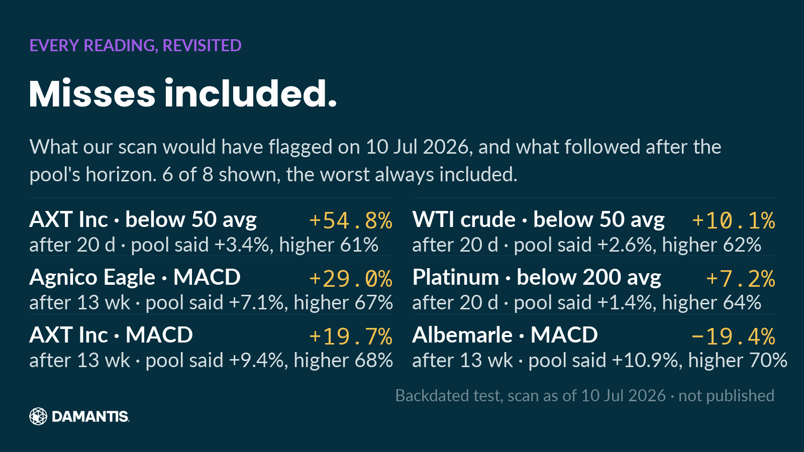
This table is a backdated test of the format, not calls we made: it shows what our scan would have flagged on 10 Jul 2026 and what followed. 7 of the 8 readings were higher after the horizon. Albemarle moved −19%, where the pool's median was +11%. A pattern that holds on average still misses on single cases, and the table shows it. From launch, the same table will hold only readings we actually published.
How we built this
Daily prices from a commercial market data provider, adjusted for dividends and splits; spot metals on weekday closes. The indicators are computed by our own code and match the data provider's own indicator figures on the same data. Every number in our posts and articles is computed from the same data as the chart next to it, and a post is only built if each number passes our data checks. Related: the risk chart nobody shows you.
Frequently asked questions
What does "RSI oversold" really mean?
That the average loss of the last 14 days or weeks was much larger than the average gain. It describes the recent past. On its own, our data shows it says little about what follows.
How reliable are technical indicators?
It depends on the indicator, the asset and the timeframe. Most readings we test do no better than the base rate; a few hold up in every split. We show which is which, every time.
Do you give buy or sell signals?
No. We show readings, what followed comparable cases, and the limits of that evidence. What to do with it is your decision.
How damantis looks at this
Every chart in this article was computed from market data, with its source and date on the image. No figure was typed in by hand. damantis applies the same discipline to its signals and model portfolio: risk first, data over narrative. See how it works at damantis.com.
Education, not investment advice.